Apr 23, 2013 Designing Effective Communications for C-Level Events

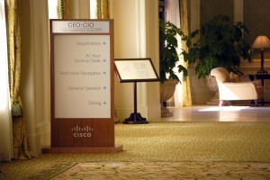
Signage by Silverlign Group
We interviewed Andrew Cambouris, Creative Director at Silverlign Group, about how they work to design effective communication for C-level events, such as Cisco’s CIO Summit. Silverlign is an integrated marketing and design agency based in Silicon Valley and part of the eBay family of companies.
Though we do much more than events at Silverlign, there’s a sense of excitement before each event that I love. There’s the rush of getting everything pulled together, and that first day when we see participants interact with devices and find the sessions and give feedback. With an event, you get first hand insights into how the users experience it, and I think that’s unique in marketing and design.
Our first C-level event was for Cisco in 2007 – the CIO Summit. We were hired to help identify and brand the Summit, and that included all the touch points: the invitations, signage, badges, program guides, evaluations, etc. We’ve been doing the CIO Summit ever since, and just wrapped up our third year of the Cisco CEO-CIO Leadership Council (CCLC) event.
Our branding approach to C-level events like these is to be ubiquitous and consistent. [Tweet this!] Branding starts with the invitation and flows through every touch point going forward [Tweet this!] – from the ride signs at the airport, to the welcome letter on their bed in the hotel room, to the badge and signage at the hotel. Consistency is key, especially when the participants for these events are repeat visitors.
That said, consistency doesn’t mean boring. From a creative standpoint we always try to push it. But the design and branding remain coherent, and there’s value in that because we’re branding the events themselves.
Below are some guiding principles we follow when designing communications for C-level events.
- Know your audience. As soon as you can dial into the audience, it helps you understand why we do things the way we do. For example, the CCLC event has some brand flexibility, but we try to keep the design very upscale and conservative from a color standpoint. And that’s part of knowing this audience and understanding the CEOs don’t care about flashy bells and whistles.
- Know your venue. When you understand where the event will take place and what kind of audience will be there, you can dial into the design to sync up with the audience and the venue. For example, we created new signs for the CCLC at the Sanctuary Hotel that used custom dark wood frames inspired by the hotel’s decor. We knew the Sanctuary would be used multiple times, so we invested in signs that would fit well in the hotel. We didn’t want to just create a sign that looked cool, we wanted to make sure that everything jelled with the guests’ experience with their environment.
- Keep things simple and direct. Over time we evolved the CIO Summit’s weighty paper conference agenda into a mobile device. But while mobile is more compact, it isn’t necessarily easy to use. Many popular event devices are packed with buttons and small elements that are cool but cumbersome. So our approach for the C-level audience was to simplify. For example, we used HTML5 to ensure the devices had big buttons and large typography. This goes back to the demographics of this audience – most CEOs are in their forties and sixties. We know young designers love small typography but that doesn’t work for this audience.
- View the event holistically, including all the peripheral materials. There’s more to an event than the brand and graphics. Other partners are involved, such as Wilsonwest, and it’s important to understand the other touch points your partners at the event are creating. Because if you work in silos, the experience will be disjointed. So, for example, we provide a quick style guide for the graphic elements we’re branding, the colors, etc., and provide it to our partners so when they create their set or signs it all aligns together.
For more information on Silverlign Group, click here.

Sorry, the comment form is closed at this time.